Punk Graphic Design – A Mirror of the Return of Political Tensions
PUNK GRAPHIC DESIGN – A Mirror of the Return of Political Tensions
Aggressive typography, unbalanced compositions, deliberately degraded images: punk graphic design is back. It appears on protest posters, in the visual identities of politically engaged festivals, across social media, and within independent publishing. This visual language, born in the 1970s amid economic and political crisis, is resurfacing today in a context that feels strikingly familiar. Its return is far from incidental; it reveals something about the current state of the world and about the role graphic design plays in reflecting it.
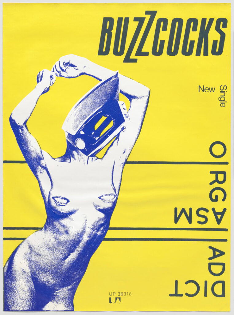
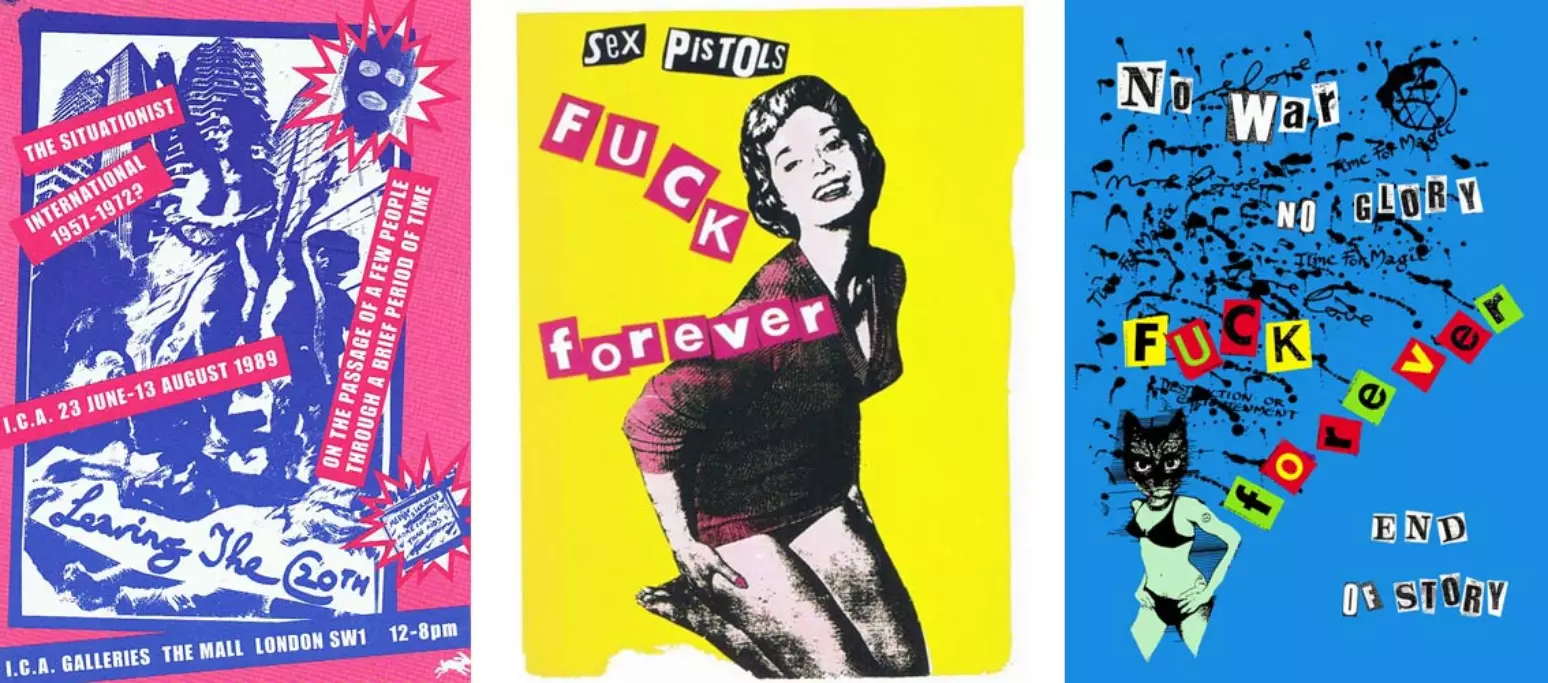
When punk first emerged in the United Kingdom, the country was facing mass unemployment, social unrest, and a profound loss of trust in institutions. Punk graphic design did not aim to organise information or reassure its audience. On the contrary, it sought to shock, disrupt, and give visual form to collective anger. Jamie Reid’s collages for the Sex Pistols, with their rough cut-out letters and crude compositions, directly attacked symbols of power. Graphic design became a tool of political confrontation: fast, accessible, and produced outside institutional frameworks.
Today, the context has changed, but the tensions remain. Climate crisis, the rise of extremist movements, distrust in the media, and political discourse fatigue have once again undermined the promise of stability. In response, contemporary graphic design is reactivating visual forms previously used during periods of rupture. Punk codes reappear precisely when graphic design ceases to function as a neutral tool and instead becomes a vehicle for positioning and dissent.
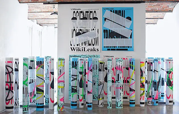
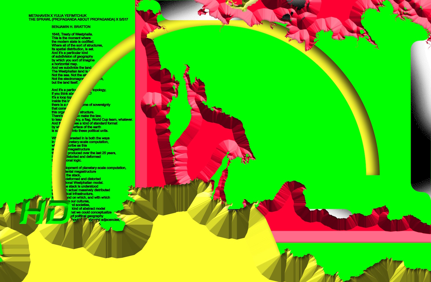
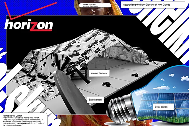
In public space, these forms are visible in activist productions, where perfect legibility matters less than impact. The goal is not persuasion through clarity, but provocation through intensity. In the cultural field, studios such as Metahaven and independent publishers embrace saturated, unstable, sometimes difficult-to-read aesthetics to address issues of surveillance, power, disinformation, and democratic crisis. These formal choices are not arbitrary; they visually translate a world experienced as fragmented and conflict-ridden.
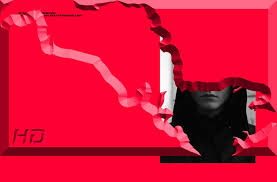
The resurgence of punk graphic design can also be understood as a reaction against another dominant visual regime: the smooth, standardised design of the digital age, shaped by platforms and algorithms. Optimised interfaces, interchangeable brand identities, neutral typefaces — this design language promises efficiency, control, and seamlessness. Punk graphic design does the opposite. It introduces noise, friction, and error. It rejects the idea of a perfectly functional world and challenges the supposed neutrality of contemporary design.
While the tools have changed, the intention remains the same. Where photocopying and manual collage once enabled rapid production of posters and fanzines, today’s punk graphic design détournes professional software, exploits glitches, excessive layering, and digital imperfections. What once resulted from limited means has become a deliberate choice. The “badly made” is no longer a constraint, but a political stance — a way of resisting the standardisation of both forms and discourse.
This phenomenon follows a cyclical logic. In times of crisis, graphic design tends to radicalise. As institutions lose credibility, visual language hardens, destabilises, and becomes charged with tension. Punk, past and present, does not create chaos; it makes it visible. It gives graphic form to a collective unease that dominant visual languages can no longer contain.
One question remains central: what happens when this graphic language is absorbed by cultural institutions or appropriated by brands? This paradox has accompanied punk since its beginnings. Yet rather than neutralising it, such recuperation seems to fuel the cycle further. Each act of normalisation eventually produces new forms of rupture.
If punk graphic design is resurfacing today, it is not out of nostalgia. It is because it provides a language suited to an era defined by uncertainty and distrust. In a visual landscape saturated with promises of stability, disorder once again becomes a way of telling the truth.

